Monday, July 19, 2010

Whimsy Blog Hop! New Stamps! Candy!


If you have come from Rowena's Blog, you have come to the right place!  If you have landed here randomly, you might want to start the blog hop at the beginning here at Chris's Blog.
Whimsy has some new red rubber released and available for purchase today and this is one of the new stamps!  Introducing,"Moonlit Ride".  I think it is one of my personal favourites that I have drawn, although I usually say that with every new one I do, lol!  I wanted this carousel horse to have a dreamy, starry look to it,  so I coloured it with dramatic colours!  (colours listed below)
There's lots of other new rubber released today too - beautifully designed sentiments by Raindrop Echo Designs Designs, and a couple more I have drawn, including a couple of cute little girls, so be sure to check them out.  And, Ann is having a sale this month on her digital sets - 
25% off!  (on her digital sets only, not red rubber) from July 17 thru July 31!!

You have until Monday July 26 to hop around to all the DT members blogs.  At that time, a winner will be drawn for the blog candy pictured here!  It is all six new release stamp sets!!


As you can see in the piccy, Whimsy is releasing my little elephant image that I had previously only offered as a digital image through Squigglefly.  Now you can get her at Whimsy in rubber!  I have dubbed her, "Jelly Bean".  
Next stop on the hop is Denise!  She is the proud owner of Whimsy Stamps, and such a delight to work with.  Hi Denise, waving!!

Card details:
I made the dark blue background paper by doing a watercolour technique using salt.  There's a great tutorial for this technique on Splitcoast Stampers right HERE.  The only difference is I used water colour paint - but you can use ink like it states in the tutorial, and it will work just as well.

And here is the colour list for the image:

The blues:
B32, 34, 37, 39
The moon and stars:
Y00, 15, 18, 19 (tiny bit of E99 on moon and on bridle star only)
The reds:
R12, 14, 17, 29
The greens:
G21, 24, 28

I am entering this card into the following challenge:
Stamp, Scrap and Doodle Saturdays: Animals
Colourless blender used throughout the horse's body to soften the area around the stars and moon. Here is your close-up:

Thanks for visiting my blog today, Precious Peeps!   God loves you and wants you to know His love, His joy and His peace!  May He bless you today with a deeper knowledge of His amazing love for you!

Sunday, July 18, 2010

Sundays With Crissy #7 - Christmas in July!


Hi Peeps!  Here's one of the Christmas/Winter images I just released as a digital image with Whimsy Stamps. I've called it "Warm Winter Wishes" and it is available now for purchase and immediate download!
Coloured with the following Copics:
Polar Bear Fur
E50, BV20, 23, B000 with R20 in his ear and E13, 19 on his nose.
Scarfs, hat and other red things:
R20, 22, 24, 27, 29, 59
Penguin Black:
C0, 1, 2, 3, 4, 6, 8
Beaks and Feet:
E93, 95, 97, 99
Turquoise Hat:
BG45, 49, 10
Striped Hat:
BG10, 11, 72, 75, 78, R24, 29
Back Ground
BG0000, 000, 01 (afterwards I sponged the edges with a greenish blue ink while it was still in the Spellbinders die - can't remember which ink)
Shadow under characters:
BG72, 10, BV20, 23
Cheek blush
0 and R20

I made it for my Sundays With Crissy challenge #7 this week, which is "Christmas In July".  I feel it is never too early to do up some Christmas cards.  Besides, it is my favourite card occasion of the year!  Why not join in and get a jump start on Christmas cards!?  Come on over and see what the rest of the Crew have designed to wow you with.  :-)  I have a new Guest Designer joining in this time too! Why not head on over to the Sundays With Crissy blog and find out who it is! 

I uploaded a static tutorial yesterday on how I use Copics to do the folds of clothes and also hair.  Scroll down to the next post if you wish to see that.
Bless you and thank you for coming by for a visit today!

Saturday, July 17, 2010

Copic Tutorial for Clothes and Hair


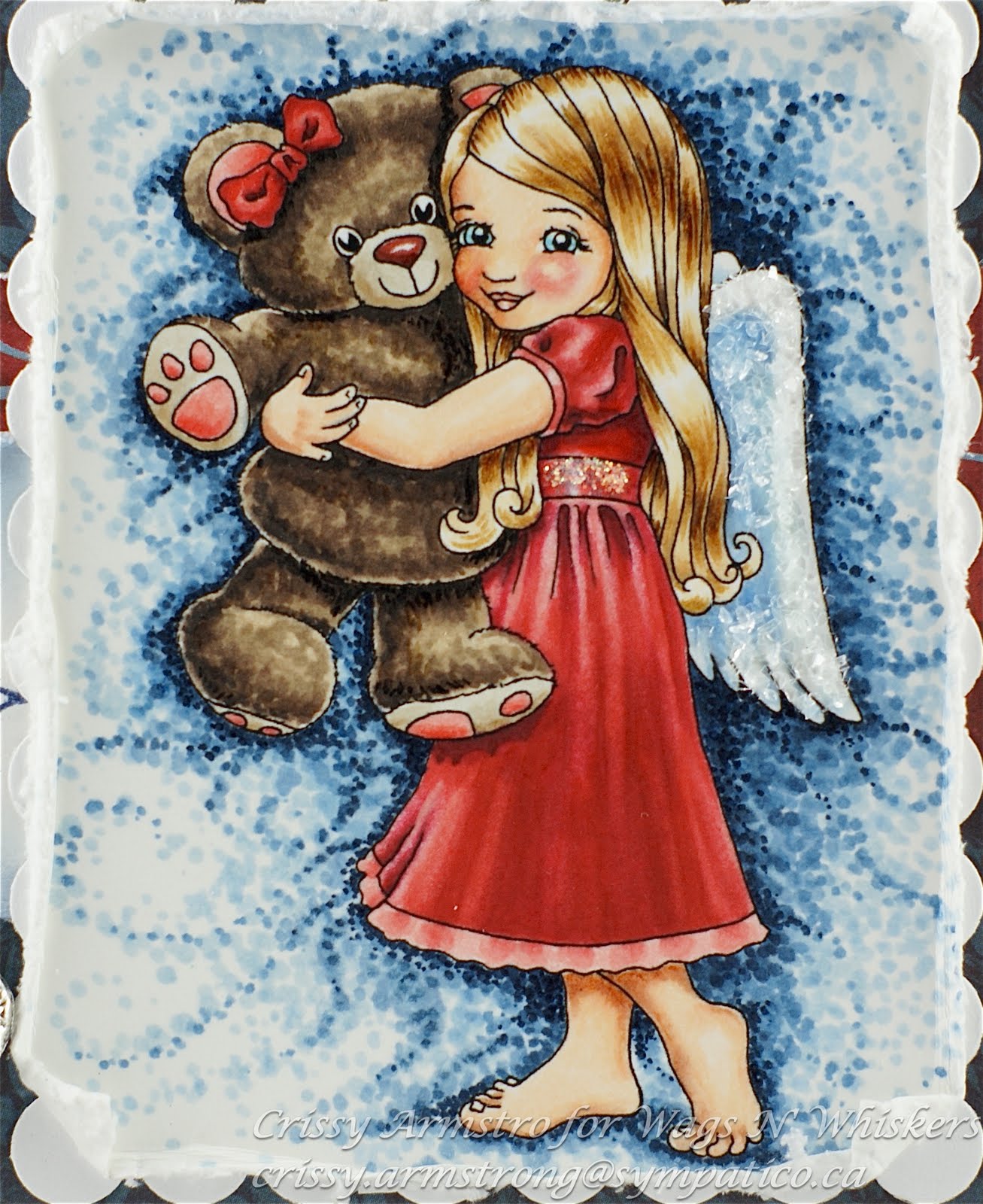
Hi Peeps!  I have two little tutorials to share with you today, on how I colour the folds of clothes and the shine and texture of hair using Copic markers.   I took still photos while I was colouring my Wags n Whiskers image called Bear Hug.   I hope I have given detailed explanations with each photo so that what I did will be clear to you.  If you still have questions, drop me a note and I'll try to clarify for  you.

Folds of a Dress:
I started by making a decision first of all where the light source would be and where the lightest highlights would be and the darkest shadows.  In this instance, I mentally placed the light source above her and slightly to the right.  This meant that the brightest points on her dress would lie on top of the folds that stick upward and outward towards the right.  The darkest shadows would be within the folds in between the highlighted areas (speaking of the area under her waist band) and within the little fold lines of her sleeve.  Also under teddy's foot and under the edge of his body where it rests against hers.
I started with the lightest red, R20 and with a very light stroke, lay down these strokes of colour.  I did not put R20 where I knew I wanted a very bright highlight.  By leaving the paper white where I want the brightest highlights to go, I don't loose them later to over-colouring... you'll see what I mean as we go on.

Now I have taken R22 and added a few strokes of this slightly darker shade beside most of my other strokes, with the exception of some of the narrow folds just under her waistband.  This just gives R20 a more gradual blend as we move towards darker reds.  I did not blend them together yet, just laid them down beside each other.

Here is where I added R24.  Again, no blending yet.  Just blocking in the colour.  Blending will come later!  I still left some parts not coloured.  In this case, I left the highlights but also I did not put colour where I want the deepest darkest shadows.  Reason for that is, the darker Copic colours tend to have a lot more pigment in them.  This thicker pigment cannot be layered as successfully.  Too many layers of dark colours will cause the ink to settle on the surface of the paper, and that does not usually look good.  It tends to look gloppy and shiny.  Is gloppy a word?  
So you can see where I left some areas un-coloured: at the bottom of her sleeve and under her sleeve,  under the teddy's foot, and the deep parts of the folds under the sash.

I made a bit of a colour jump here, all the way to R29.  I could have used R27, but I wanted her dress to have the appearance of a very deep red.  So R29 went into all the places I had left for the darkest shadows, and over a major portion of it on the front. I pulled some strokes up into the folds where I had left some white spaces.  Again, I was not concerned with blending at this point.

Here I added R59 under the arm and along her back, under the lock of hair that falls under her arm and beside teddy, in the narrow folds up near her sash, but very little there, and a teeny tiny bit along the folds at the bottom front of her dress.

Now I was ready to do some blending.  I took R20 and began to blend starting in the places I had left white on her dress. Because I left the highlights white, they remained very vibrant and light with only a thin layer of R20 over top.

I realized after blending with R20 and seeing how it didn't blend out enough that I would need to add R27 to smooth the transition between R24 and R29.  And so I added some R27 here:

I went back to R20 to continue to soften the blends all over, being careful to avoid the very light highlighted areas and the very dark shadows.  Also, I fixed some of the bleeds that happened using the blender pen.  Red is the hardest colour to remove with the blender.  But it can be done, up to a point.  The trick is to push the colour back towards the line a few times, then wait about five minutes for the paper to dry.  Then repeat the process:


After I was satisfied with the blends of reds, I took the colourless blender pen and did a few repeated feather strokes down the whole length of the dress.  I started at the bottom of the sash where I put the lightest red and pulled the blender pen downwards into the deep red below.

Here I went over the darkest darks with R59, and added a very dark shadow under teddy's foot. 

I added the finishing touches on the trim at the bottom of her dress.   And one more time blending with R20 on some of the streaks I had made with the blender pen.  Done the dress now!

Shine and Texture on Hair:
I started with small bits of colour using E50 and left areas white that I wanted to save for highlights and darkest shadows.  I like to leave highlights just below the part, and then again about half way down the locks and esp. on the outer or upper parts of waves or curls.

Here I added E53 in feather strokes, leaving some of the lighter shade showing.

E55 was added next.  Again, I was not concerned with blending, esp. because lines are appropriate to show hair (or fur for that matter).  I did not cover the whole area where I had laid down E50 and E53 but left some of those shades still showing. 

Here I added some E57.  Now here is the trick: I barely touched the tip to the paper.  Those tiny skinny lines are next to impossible with the brush tip of most Copics.  However, if you can barely let it touch the page, you can get these tiny lines!  Notice again, I used it very sparingly. I was careful to use it under her big swirly lock, under her arm and under her chin/cheek area because those places would naturally be in shadow. 

 I have added more feather strokes with E55 and 53, being careful to keep the highlighted areas white.  Tip:  Leaving a white highlight gives the appearance of something very smooth and shiny.  Don't blend out or add colour to white highlights, unless you want the appearance to look more textured, as in the case of her red dress. 

I went over the darks a few more times with more unblended feather strokes using E57.  I am satisfied now that the hair is done!

And now, here is the card I made once I was done the teddy and background too:


I am entering this card into the following challenges: 
The sketch is from Truly Scrumptious
Fussy and Fancy: Stitches, Scallops and Sparkle
Res-Q challenge: Metal and red
Whoopsi Daisy: Bright or hot colours
Incy Wincy: Distressing
Paper Sundaes: Lots of Layers
Flutter By Wednesday: 3 or more Layers
For Fun Challenges: Use your favourite colouring medium

I added some Diamond Dust glitter to her wings and Stickles to her waist band sash. 
Thanks for looking and if you are still with me, you're a trooper!
May God bless you and keep you in His Amazing Love!


Tuesday, July 13, 2010

Zoe's Amazing Creation


The other day I received a most incredible creation in the mail, all the way from Australia no less!  Zoe McGrath created this AMAZING carousel that WORKS!  See the pink round dial with the pearl accent?  You just use the pearl as a handle, and turn the knob, and the horse goes UP and DOWN!  I was incredulous that Zoe would mail this to me, from Aussie land to Canada where I live!  I am a lucky, lucky girl!  Here is a link to her original blog post, where she has a short video showing this carousel actually working! 
Zoe used Wings of Hope, the horse I did for Whimsy Stamps that is being used to raise funds for Haiti in the aftermath of the devastating earthquake.  Two dollars from every sale of this rubber stamp is donated to help in Haiti's recovery. 
And I'd like to help raise awareness for Zoe's brand new store based out of Australia!  She is selling all sorts of lovely crafting supplies for the stamper/scrapper, so go check it out HERE!
Here are a couple of side views of this work of art that show you some of the details:


Zoe has really touched my heart that she would make this beautiful creation and then send it to me.  Thank you Zoe!  You're the best! xo
Thanks for visiting my blog today Precious Peeps.   I hope you enjoyed seeing what Zoe made for me!

Sunday, July 4, 2010

Happy 4th of July!!


To all my American friends to the South, I hope you are having a safe and happy holiday weekend!
I am Canadian, but I love my US neighbours and have a lot of blogging friends south of the border.  And because I love them and love their country, I wanted to draw a stamp for them to use for Independence Day cards (sold as a rubber stamp by Whimsy).  I call it, "Proud to Be".   As I was drawing it, I kept hearing that song, "Proud To Be An American".  It was stuck in my head!! lol 
Visually, I was inspired by the American flag (obviously!).  The feathers and wings on the design represent their National bird, the Bald Eagle.  There are a couple of accessory images in this set, one is the olive branch you see stamped around the edges of the main panel.  The other is a rose (not shown) which is the National Flower.  The olive branches are on one of their coins (can't remember which one right now).  So it really is an all-American set! 
This is one of my personal favourite carousel horse images, and hopefully conveys the pride I know all Americans have in their beloved land. 
Now this is a partial CASE of a gorgeous creation by Whimsy DT gal, Simmone.  You really should go see what she did too!  I love how she coloured the mane and tail.  It looks so soft. 

Sorry I don't have a colour list; I coloured it in awhile ago.  :-(  But I did use Copics, and Tim Holtz  Antique Linen Distress ink on the tag and for the olive branch. 
Here is your close-up:


God bless you, and God Bless America!!